Eighties Online Store
Designing an e-commerce platform for Eighties, meeting the goals of both the customers and the seller.
Role
UI UX Designer
Industry
E-Commerce
Duration
2 months

Design Brief
Designing an e-commerce platform for a vintage clothing store meeting the goals of both the customers and the seller.
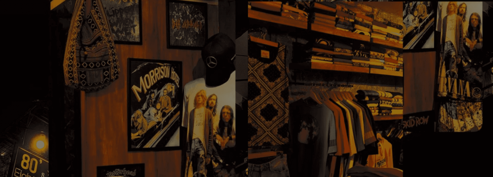
About the Store
80s is a vintage unisex clothing store.
Eighties fashion store started back in 2016 as a clothing store targeting an audience looking for cheap vintage clothing. They believe clothing doesn’t have to be expensive and that we should be able to change styles as we need and please.
80s is very successful offline. They have 4 stores around Kerala.
Problem They Face
They are very late in the game for a digital transformation (they only have an Instagram account to showcase the product.)
Customers have been asking about websites for years, complaining that when they visit the shop they can’t find the product they have seen on their Instagram Account. (It's either sold out or yet to reach the store)
RESEARCH
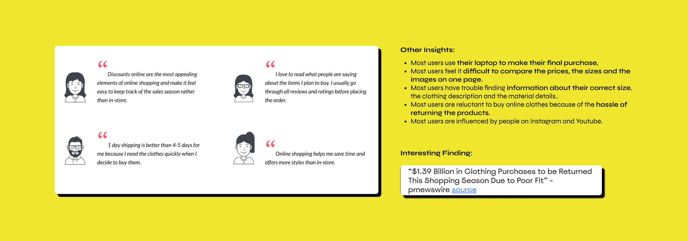
Identifying how online shopping works :
To understand pain points, user needs, and the user goals of online clothing shoppers, I spent a whole day conducting secondary researches. And getting stories about online shopping and in-store shopping experiences.
Some of the things I found:
Creating Personas
“Data often fails to communicate the frustrations and experiences of customers. A story can do that, and one of the best storytelling tools in business is the customer journey map.”
— Paul Boag, UX designer, service design consultant & digital transformation expert

Journey Mapping

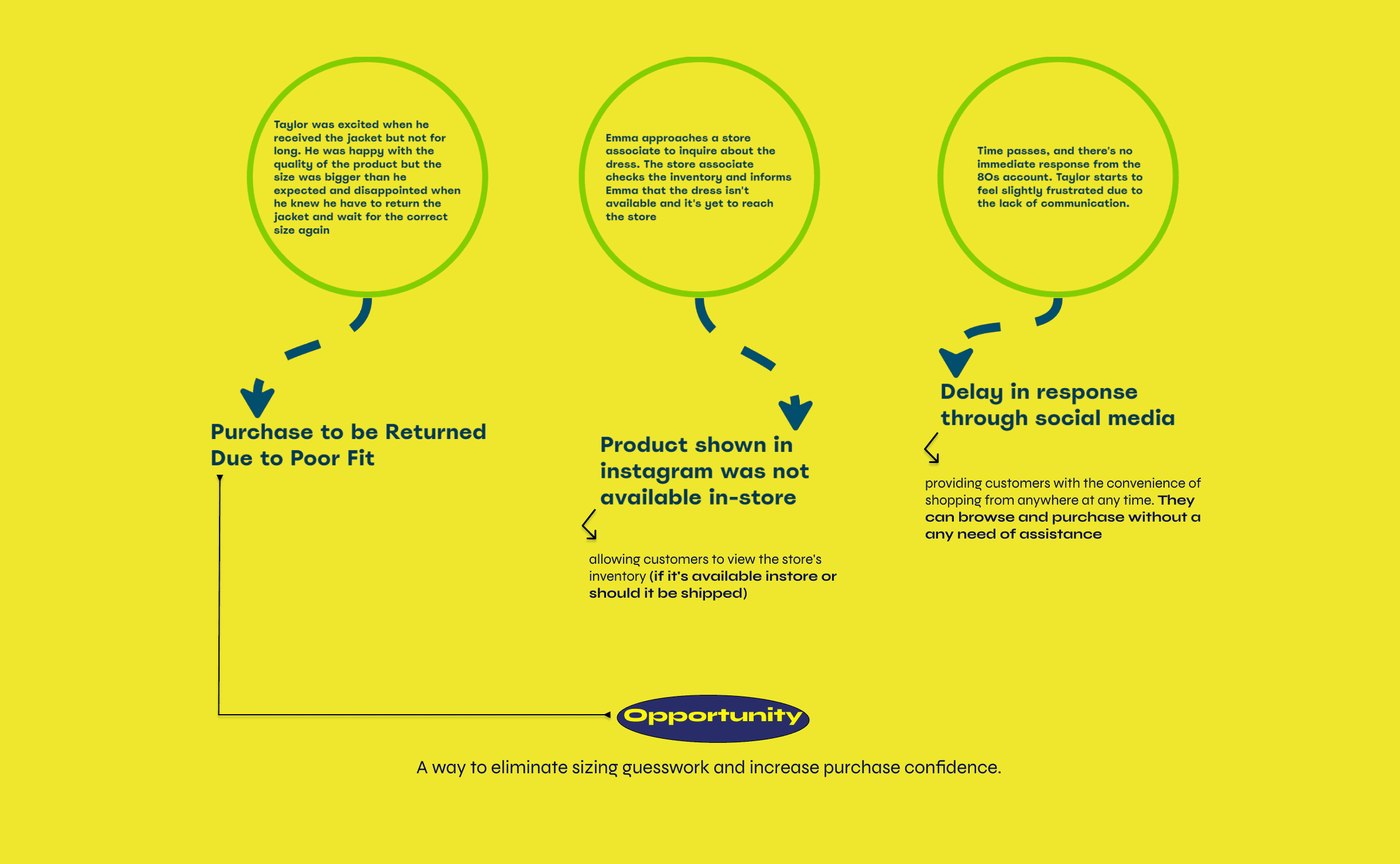
These are the emotional ups and downs Taylor experiences while trying to order the vintage jacket through Instagram messages. The delay in response initially leads to frustration, and it's replaced by excitement when he finally receives a response and completes the purchase, but again makes him disappointed when the size of the product was bigger than he expected.
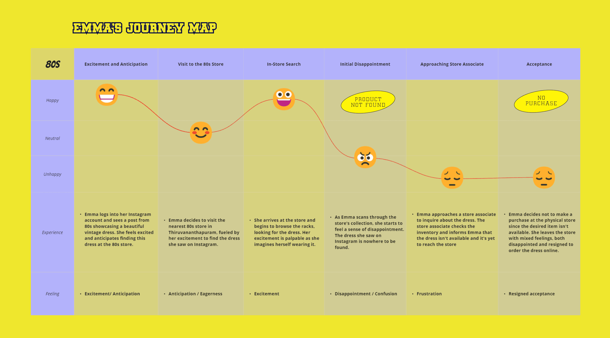
This journey map highlights the emotional rollercoaster Emma’s experiences when her expectations are not met in the physical store after discovering a product on Instagram. It emphasizes the importance of consistency in showcasing available products across different channels, as well as providing clear information to customers when a product is only available online.
What Am I Doing: Identifying the goals of the business, their customers and also the mutual goals
Why Am I Doing This: To create a platform meeting the goals of both the customers and the seller.
IDEATION PHASE
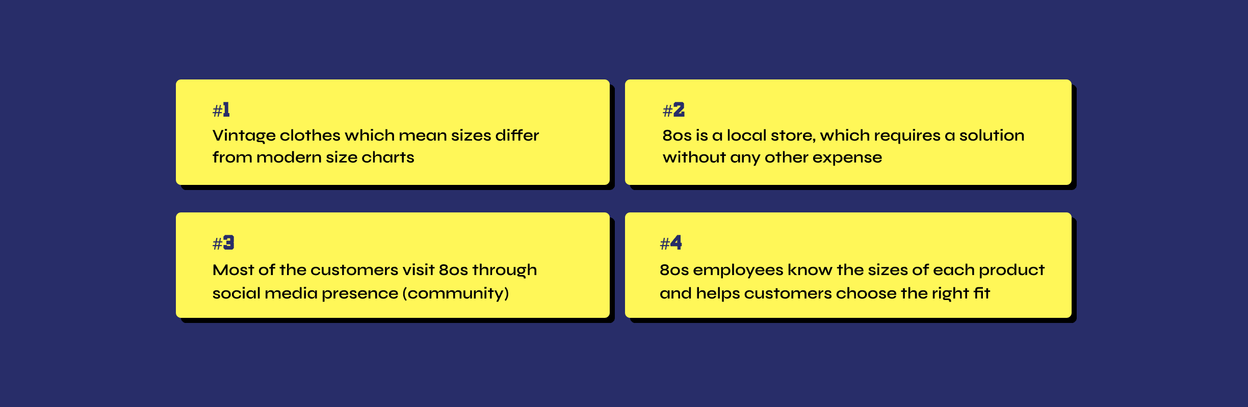
Main Problems Identified
Creating an HMW Statement
How Might We Statement allowed me to reframe our insights into opportunity areas and innovate on problems found during the research.

Competitor Analysis
I looked into the existing solutions to understand how this problems are currently solved in the market and found out interesting methods:
Tailoring
Measurements based on body scanning
Showing real-life photos
Alteration service pre-delivery
using AR and VR to render clothes on different models
Things to keep in my mind:
As a UX designer, it is important to me to check if the solution will be acceptable for client, so some of the few things I kept in mind are:
What I Chose
Through all this insights and research, I came with 2 most feasible solutions to solve the problem i’ve identified.

Insights To Features
Feature Functionality List
I listed the key features that would be included in my product’s design based on research conclusions, the business needs, the persona, and the market I analyzed.
Afterwards, I prioritized the features on the list based on their importance to the business and the users.

Content Categorization
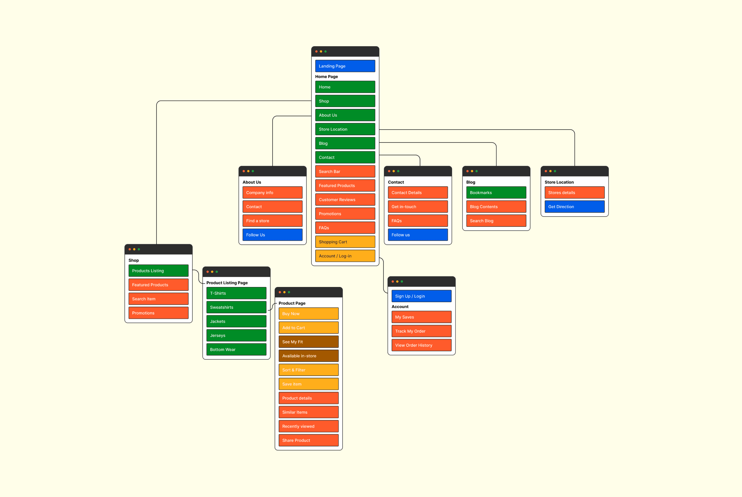
A sitemap for a website typically includes a hierarchical representation of the site's structure, So I started by outlining the main sections and pages the website must include that align with goals of both seller and customer.
Sitemap
User Flow
User flow is also done to map out the path users would take through the 80’s website, helping me understand and optimize the user journey for a seamless and intuitive experience.

SETTING UP VISUAL DESIGN

Typography
The combination of Noto Sans and Return Pass balances readability, aesthetics, hierarchy, and brand identity that resonates with 80’s desired image and user expectations, which can be particularly relevant for an online store with a focus on fashion and aesthetics.

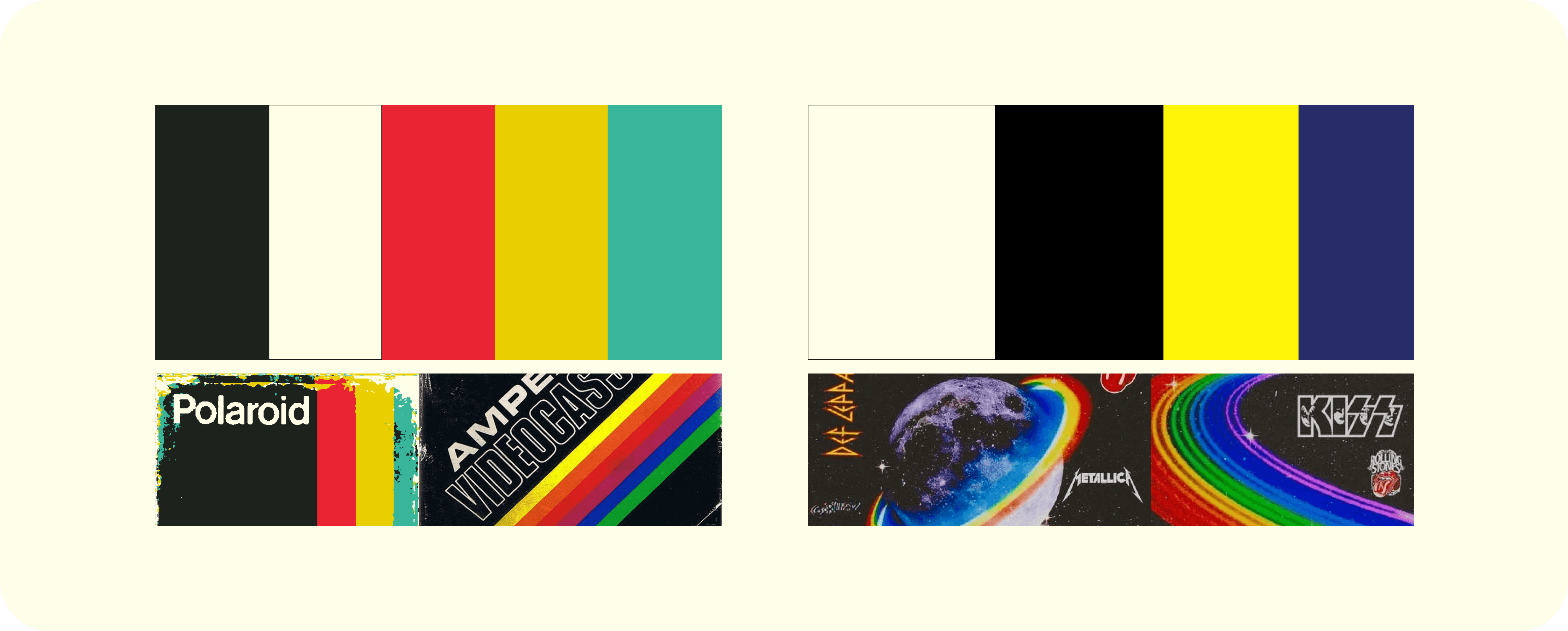
Colors
I started by extracting the popular palettes used in that era to bring back the vintage/retro feel. These color palette options aim to capture the essence of both vintage and modern styles. One of these options can be chosen to align with the overall design narrative.
Final Selection

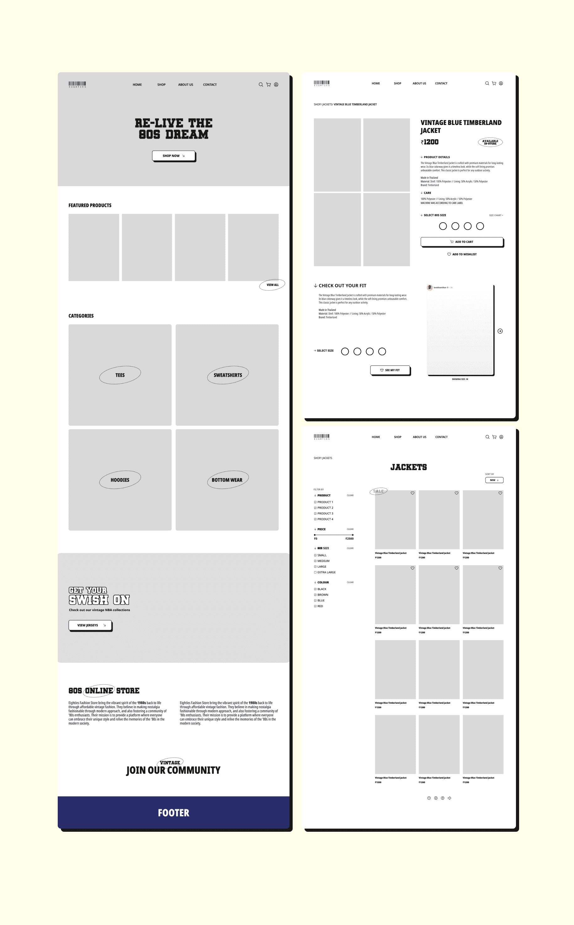
WIREFRAMING
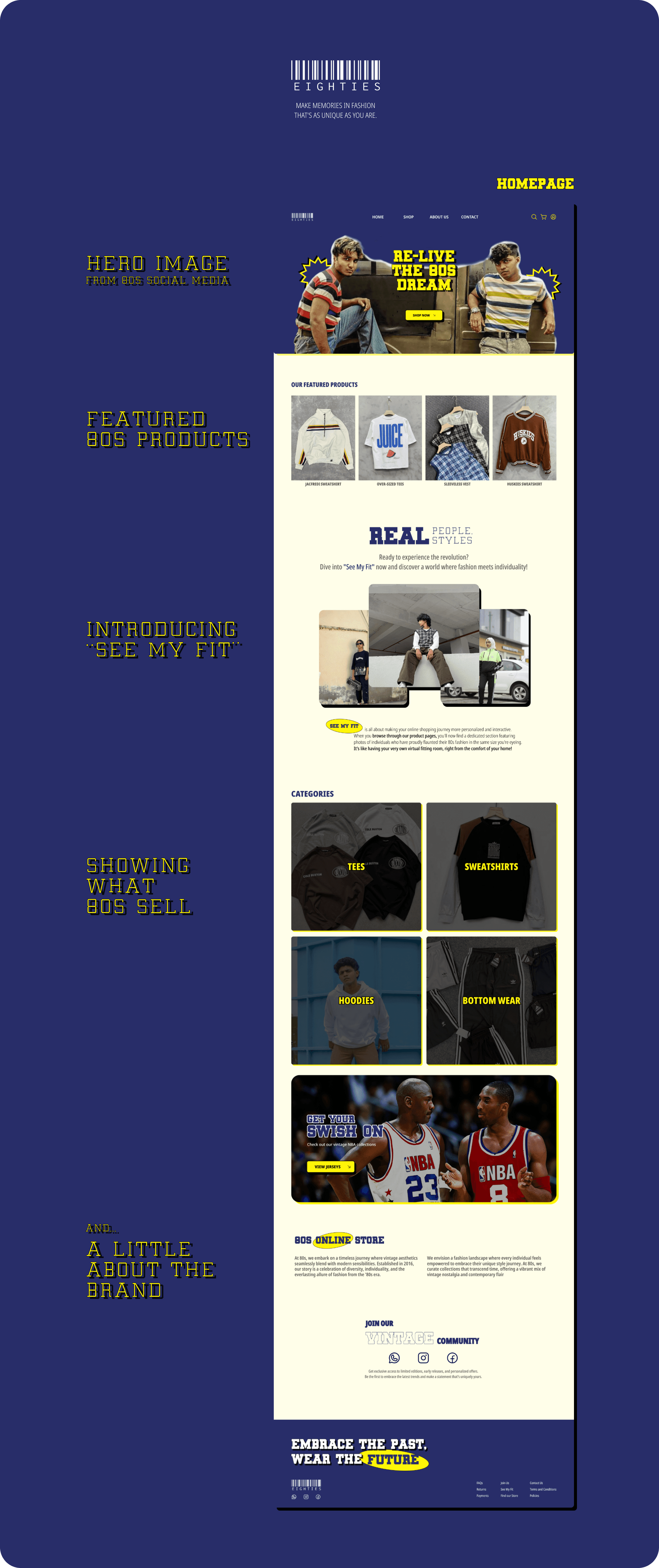
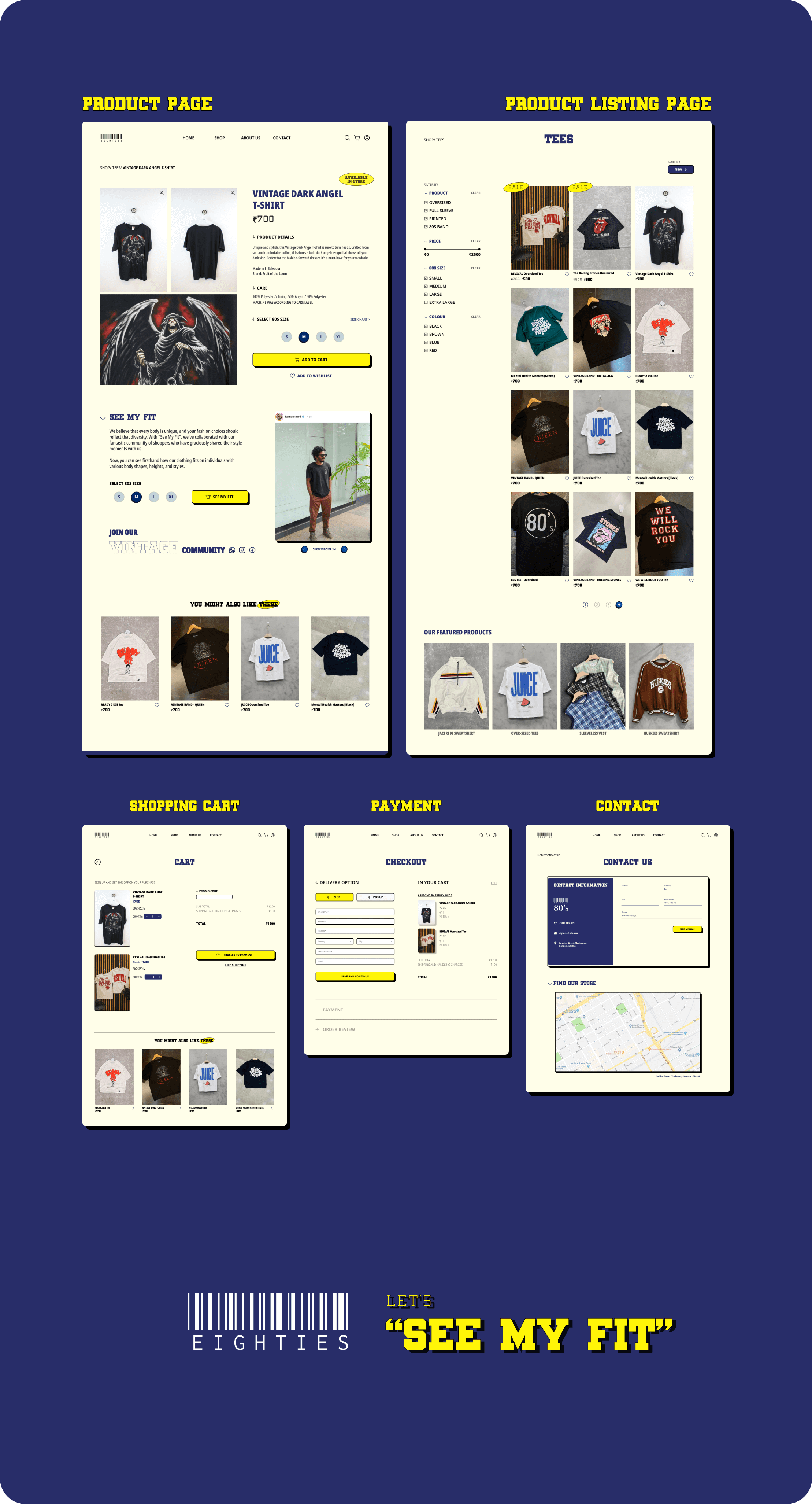
FINAL DESIGN
THANK YOU FOR READING.
Design Brief
Designing an e-commerce platform for a vintage clothing store meeting the goals of both the customers and the seller.
About the Store
80s is a vintage unisex clothing store.
Eighties fashion store started back in 2016 as a clothing store targeting an audience looking for cheap vintage clothing. They believe clothing doesn’t have to be expensive and that we should be able to change styles as we need and please.
80s is very successful offline. They have 4 stores around Kerala.
Problem They Face
They are very late in the game for a digital transformation (they only have an Instagram account to showcase the product.)
Customers have been asking about websites for years, complaining that when they visit the shop they can’t find the product they have seen on their Instagram Account. (It's either sold out or yet to reach the store)
RESEARCH
Identifying how online shopping works :
To understand pain points, user needs, and the user goals of online clothing shoppers, I spent a whole day conducting secondary researches. And getting stories about online shopping and in-store shopping experiences.
Some of the things I found:
Creating Personas
“Data often fails to communicate the frustrations and experiences of customers. A story can do that, and one of the best storytelling tools in business is the customer journey map.”
— Paul Boag, UX designer, service design consultant & digital transformation expert
Journey Mapping
These are the emotional ups and downs Taylor experiences while trying to order the vintage jacket through Instagram messages. The delay in response initially leads to frustration, and it's replaced by excitement when he finally receives a response and completes the purchase, but again makes him disappointed when the size of the product was bigger than he expected.
This journey map highlights the emotional rollercoaster Emma’s experiences when her expectations are not met in the physical store after discovering a product on Instagram. It emphasizes the importance of consistency in showcasing available products across different channels, as well as providing clear information to customers when a product is only available online.
What Am I Doing: Identifying the goals of the business, their customers and also the mutual goals
Why Am I Doing This: To create a platform meeting the goals of both the customers and the seller.
IDEATION PHASE
Main Problems Identified
Creating an HMW Statement
How Might We Statement allowed me to reframe our insights into opportunity areas and innovate on problems found during the research.
Competitor Analysis
I looked into the existing solutions to understand how this problems are currently solved in the market and found out interesting methods:
Tailoring
Measurements based on body scanning
Showing real-life photos
Alteration service pre-delivery
using AR and VR to render clothes on different models
Things to keep in my mind:
As a UX designer, it is important to me to check if the solution will be acceptable for client, so some of the few things I kept in mind are:
What I Chose
Through all this insights and research, I came with 2 most feasible solutions to solve the problem i’ve identified.
Insights To Features
Feature Functionality List
I listed the key features that would be included in my product’s design based on research conclusions, the business needs, the persona, and the market I analyzed.
Afterwards, I prioritized the features on the list based on their importance to the business and the users.
Content Categorization
A sitemap for a website typically includes a hierarchical representation of the site's structure, So I started by outlining the main sections and pages the website must include that align with goals of both seller and customer.
Sitemap
User Flow
User flow is also done to map out the path users would take through the 80’s website, helping me understand and optimize the user journey for a seamless and intuitive experience.
SETTING UP VISUAL DESIGN
Typography
The combination of Noto Sans and Return Pass balances readability, aesthetics, hierarchy, and brand identity that resonates with 80’s desired image and user expectations, which can be particularly relevant for an online store with a focus on fashion and aesthetics.
Colors
I started by extracting the popular palettes used in that era to bring back the vintage/retro feel. These color palette options aim to capture the essence of both vintage and modern styles. One of these options can be chosen to align with the overall design narrative.
Final Selection
WIREFRAMING
FINAL DESIGN
THANK YOU FOR READING.
Other projects
Eighties Online Store
Designing an e-commerce platform for Eighties, meeting the goals of both the customers and the seller.

Mamoos Order Management
Reaserch focused : A Mobile application to enhance a aspect of the day-to-day running of a small-scale business

Papi Super Cars
A rapid homepage redesign for a car dealership, focused on creating trust and brand value through design.
Load More
Load More
Load More
